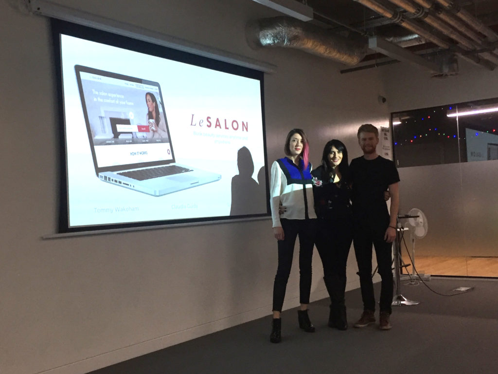
of an at-home beauty services company.
What is LeSalon?
For my UXDI client project at GA, I had the chance to work for an inspiring company: LeSalon.
LeSalon is a marketplace that offers at-home beauty services that are accessible
and delivered by skilled professionals in homes, hotels and offices.
Their niche market is based on the needs of the modern individual:
adapting the delivery of beauty services to fulfil the requirements of busy schedules.
In 2014, the co-founders Jean-Michel & Natasha launched LeSalon:
providing a convenient service for clients and an empowering opportunity for professionals.
Their services are convenient, affordable and of high quality.
They want to come off as friendly, approachable but also professional.
LeSalon provides 3 different services for now: manicure, pedicure and waxing.
The brief
My teammates and I were asked to review the home page and the booking process
in order to reduce the bounce rate and improve the conversion rate.

Problems
The 3 main UX issues were related to:
– Conventions: A basket split in 3 (in 3 difference places on the screen)
– Consistency: The nav bar was clickable for some steps (not all the time)
– Copywriting: buttons with misleading labels
We fixed as well 3 main visual issues:
– Branding: Emojis didn’t reflected the brand spirit
– Visuals: Images weren’t consistent
– Colours: Buttons were confusing as they all had the same colour (too many CTA)

Outcomes
The checkout process is now sleeker, with only one amendable basket.
Users can easily see their progression thanks to a clickable progress bar
and come back anytime to a previous step.
The next-step buttons are placed at the same place on every screen.
The visual design overall is more consistent and readable.
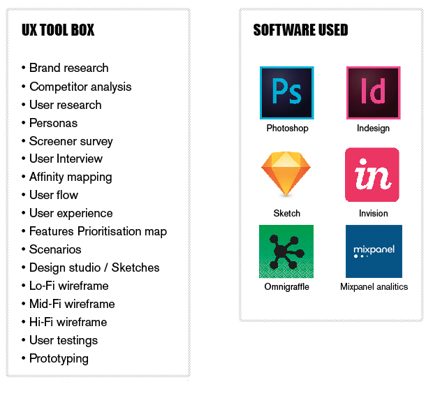
Our UX tools
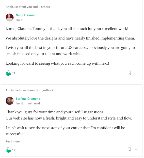
Feedback from the CTO and the mobile developer at LeSalon

Video of the final prototype
Want to know more about my process?


