& payments straight from your table
What is Chilango?
Eric Partaker and Dan Houghton were high flyers at Skype before setting up Chilango.
Now their Mexican restaurant brand is all set to soar overseas.
They started in 2005 and opened their first restaurant in London on Upper Street in Islington in 2007.
Chilango restaurants are self-service: You can either queue, order and pay
or order on the responsive website and pick up your food later on.
They deliver through Uber Eats and Deliveroo as well.
They don’t do table service for now.
The brief: New needs for a fast-growing company
2 weeks sprint UX concept project: Chilango sees an opportunity to leverage existing customer habits
by introducing a mobile website that handles ordering and payment for groups.

Problems
Our main problems to solve:
- Customers should be able to order from their table
- Groups of users should be able to all order to the same table
- The product should handle splitting the bill and payment
- Keep the strong brand identity
- Food should be delivered at the same time
Outcomes
We created a product adapted to users’ needs, guiding them step by step
till the payment while sitting and chatting with their friends at the restaurant.
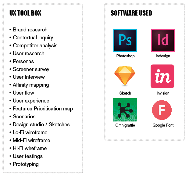
Our UX tools
Video of the final prototype
In this scenario, you are sitting at the table 4 with 2 other friends.


